Mobile User experience guidelines
Below are a set of user experience guidelines based upon writings and presentations by various mobile design experts, trying to define some core bedrock of ideas to guide tactical decision-making.
Leverage platform OS models, metaphors, and elements to achieve an experience consistent with user expectations for that device. For example, Android users expect “touch and hold” to call up a contextual menu of options, while “touch and hold” on iOS causes the object to “wiggle,” ready for deletion. And avoid desktop idioms such as floating windows, hover states, resizable panels, scrollbars, etc.
Balanced coherence: As appropriate for your app, balance functional and visual coherence across mobile, web, and desktop channels. Yes the functionality, capability, and visuals may vary per OS (see When in Rome…), but the experience should be intuitive and familiar when switching from one platform to another. Every pixel of the interface should add value to the user experience. Make it beautiful, and make it feel like a family.
Speak its power: Create clear, explicit, and discoverable UI controls that convey exactly what they do, like a light switch. Mobile users are often “on the go” and prefer obvious clear actions to complete tasks.
Animate to delight and orient: Leverage mobile OS animations and transitions to show the placement of hidden controls, suggest orientation/navigation/location, and add delight. For example, upon first launch, gently animate a hidden search field to visually cue the user to its placement.
Pivot, snack, bursts: Support “snacking” by enabling users to pivot through tasks and information in quick bursts. Remember, the user is not chained to a desk for hours. They are often in a state of “constant partial attention,” multitasking across physical and virtual contexts, sometimes one-handed while doing something else.
Edit ruthlessly: Don’t cram an entire desktop app into a phone or tablet. Focus, prioritize, and simplify to what matters most. This includes verbiage, imagery, features, buttons, icons, and especially menu commands, which should be exposed in clear visual ways.
Beware “fat finger”: Provide easy recovery from accidental taps and keep critical controls separated. Ask yourself: How can a mobile user still make use of this app with one hand while holding a coffee cup?
Minimize typing, maximize defaults: Despite auto-suggest, typing on a phone is difficult. Use defaults if possible, or carry-over from previous saved sessions/states, etc.
Think about the ecosystem, not just this device: Don’t design a mobile app in isolation. Keep in mind the ecosystem of functionality; your app should express a unified look and feel across multiple channels and devices. This is especially true if designing for multiple mobile OS platforms.
Focus on being useful, straight-forward…and fun! Don’t forget the cool factor of using mobile devices and apps. It counts towards your product’s brand perception, especially in over-crowded app stores. Users will reject your app brutally and quickly!
For your mobile UI, always ask…
- Can users make sense of it…quickly?
- Does each screen speak its power?
- Can I simplify this?
- Is this intuitive?
Mobile User experience
There is an intimate relationship between a user and their mobile device.
While an intimate relationship between an individual and their mobile device may seem like a given, the depth of that relationship probably goes deeper than most initially realize. In fact, I argue that the relationship extends to a physical level and the exchange of bodily fluids.
Imagine that it is a hot summer day and someone asks if they may borrow your mobile device to make a call. You hand it over. What level of trust does this simple act portray? Consider those around you right now: How many of them would you loan your mobile device to without hesitation? In your social circles, is it acceptable to decline such a request? How does context influence this scenario? What if you are at work? At a bar? How about a family reunion?
Let’s assume that this person is noticeably respectful of your device and the personal data it contains while making their call. At the call’s completion, the individual immediately and graciously returns it, whereupon you notice that it has accumulated an amount of … goo (perspiration, humidity, etc.) that is typical of mobile device use on a hot, sticky summer day…but then again, it isn’t your goo.
From a gooey physical level to a level of data privacy and security, there is an intimate bond between an individual and their mobile device, the strength of which often elevates the mobile device to the status of iconic personification. I am my phone. My phone is I.
In order to meet user expectations, mobile experiences should assume a semi-guarded state of primary usership; however, we must also responsibly protect our users. As the trend of embedding ourselves into our mobile devices increases, so does the cost of our devices being compromised. Assume primary ownership, allow for secondary usership, and plan for what might happen should we lose ourselves.
In a worst-case scenario, a compromised mobile device containing a significant amount of personal data would become the networked equivalent of a voodoo doll, where actions performed via the mobile device could cause actual harm to the individual personified by the device. In cases such as this, a remote wiping of all data on the device may be a user’s only recourse.
Screen size implies a user’s state. The user’s state infers their commitment to what is on the screen.
Imagine that you have been looking forward to seeing a particular blockbuster movie since the day it was green lit, and now that the day of its release has finally come you are going to get the most out of the experience by going to see the movie on the largest IMAX screen in the tri-state area.
Let’s say that when you finally take your seat in the sold-out theatre, you notice the person sitting next to you has a very annoying laugh. There is nowhere else to sit in the theatre, and you’ve been dying to see this movie for more than a year. What are the chances you abandon the experience and walk out? Probably fairly slim to none.
Now let’s say that you were backpacking through Europe when the above blockbuster was released, and that you have been equally anticipating the movie’s Blu-Ray release. To celebrate the release, you and your friends are gathering at the home of the friend who has an impressive home theater featuring a 52-inch HD screen, and again you find yourself seated next to the guy with the annoying laugh. Now how likely are you to abandon the experience? Probably more so than above, but still not likely.
What if this scenario played out in a college dorm room and the movie was being viewed on a 22-inch computer monitor? What if you were sitting next to the guy with the annoying laugh? The chances that you might abandon the experience are probably increasing.
What about a mobile device’s 3.5-inch screen? Is there any way you would sit next to some random person with an annoying laugh for 90 minutes to watch that movie? Probably not.
Although there are any number of social and environmental factors that would affect the user abandonment rate in the experiences described above, it is consistently possible to estimate a user’s level of commitment to an experience based upon the size of the screen through which they are engaging it.
Since mobile devices are likely to be the smallest screens in a user’s experience, the design of mobile experiences must accommodate the user’s varying commitment and distributed attention. How an experience accommodates these conditions will change depending on experience type — game, banking application, or the like — but the underlying impetus remains the same.
Mobile interfaces are truncated. Other interfaces are not.
A dreaded task that usually accompanies getting a new mobile device is the act of transferring your data from the old device to the new. In years past, this meant arduously re-entering all of your contacts via the device’s, most likely E.161 (12 key), keypad.
There were a few early, notable attempts to ease this burden. GSM service providers pushed device manufacturers to save all user data to the devices SIM card by default, but the card’s limited storage capacity produced a poor user experience. On the other hand, CDMA service providers began automatically transferring address books between devices as a customer service. Even early on it was widely acknowledged that although an individual wanted to use information on their mobile device, they would go to great lengths to avoid having to manually enter that information.
Palm, and later Research in Motion, sought to improve this fact of mobile user experience by introducing and then proliferating the practice of syncing. This concept paired the truncated mobile interface with a full-sized desktop interface, allowing the user to easily and reasonably efficiently enter their address book data via a familiar QUERTY keyboard. Although this feature was initially limited to smart phones, it has since been incorporated into a wide swatch of consumer-grade devices. In fact, the notion of syncing has become so ubiquitous in mobile computing that the syncing of one’s entire networked identity is a core plank of Google’s Android operating system.
Even as miniaturized QUERTY became and becomes a more standard feature for all mobile devices, the truth remains that mobile interfaces are truncated and better used for manipulating data rather than entering it. One might conclude that as mobile devices continue to incorporate increasingly impressive sensor arrays, even standard, consumer-grade devices will provide powerful data collection capabilities. Regardless, data collection is not data entry, and data entry is not likely to become a mobile-appropriate activity.
Design for mobile platforms — the real ones.
There is a prevailing tendency is to discuss mobile platforms in terms of device manufacturers and service providers. This is understandable. It is fun and easy to get caught up in the moment of the latest tech demo, press release, or rumor. However, in needlessly binding the dialogue to the news of the day, we create unnecessary segmentation across an already complex landscape. The overall conversation is better served by focusing on the mobile platforms that have emerged as constants over time. Those four platforms are voice, messaging, the internet, and applications.
Voice
Voice was the original mobile platform, but it is also the platform with the most nebulous future. Don’t get me wrong: People will always need to make an occasional phone call. However, the frequency with which we are doing so is declining. Why? Mobility is as much about efficiency as anything else, and telephony (vocal communication and vocal response interfaces) has proven more difficult to optimize compared to other methods of interactivity.
For example, let’s say that you wanted to verify that your paycheck had been deposited. Most banks offer both tele-banking and online account access. Which interface are you likely to use, and why? How about if you wanted to order a pizza? Would you rather call, be placed on hold for five minutes, and then dictate your order to a multi-tasking teenager, or would you rather just use a GUI to do it?
Messaging
Friedhelm Hillebrand, the architect of the messaging (SMS) specification, described the platform’s limit of 160 characters as “perfectly sufficient.” The question we must ask ourselves in considering this mobile platform is, “Perfectly sufficient for what?” Although Hillebrand can provide several reasons for how he arrived at the 160-character limit, the one that I have always found the most interesting is that his team discovered that most postcards typically contain 150 characters or fewer.
Have you received or sent any postcards recently? If you have, they were likely either brief social communications (“Having a great time. Wish you were here!”) or they were simply task-oriented such as RSVP-ing for a wedding or canceling a subscription.
Messaging trends today continue to affirm Hillebrand’s postcard comparison. The vast majority of SMS traffic consists of social interactions within small groups of individuals. The second tier of usage is comprised of simple task-based transactions such as voting, entering contests, and receiving notifications.
In both cases, SMS and postcards, content-heavy experiences are a minority occurrence as the media is not designed to accommodate such a level of engagement. Furthermore one could argue that due to the designed efficiency of the messaging platform, that a content-heavy experience would be far from appropriate.
The Internet
The Internet is the most awkward of the mobile platforms in that it is the one that is the least natively mobile. Currently almost 95% of all Internet users experience the web via displays with resolutions of 1024×768 or greater. As such, 1024×768 is observed as a fairly universal standard and is what a significant portion of Internet-based experiences are designed to. Given that mobile displays typically range between resolutions of 60×120 and 480×320, it is fairly obvious that most Internet-based experiences aren’t designed with mobile users as a primary consideration.
As a means of making Internet-based experiences more accessible to mobile users, most mobile web browsers have been designed to include adaptive methodologies for displaying larger experiences on smaller screens. While these adaptive tactics, which typically employ pan and zoom-esque interactions, have undoubtedly made more of the Internet accessible to mobile user, one could hardly argue that it has resulted in a desirable user experience. In fact, if browsing the Internet from a desktop is regarded as a scanning activity, than browsing the Internet through the adaptive lens of a mobile browser might best be described as a squinting activity.
As mobile web usage has continued to emerge as a somewhat common activity, the assumption that Internet-based experiences are to be automatically adapted for mobile users has given way to the design of alternative experiences specifically for mobile users. While this trend has provided mobile users with more efficient and scannable web experiences, it also has the potential of overplaying the users’ expectations for Internet-based mobile experiences.
As Internet-based mobile experiences have become more device-centric and sophisticated, they have begun to resemble mobile applications, thus creating a scenario where users might expect the Internet-based experience to function as a mobile application would. The distinction between desktop applications and Internet-based experiences may be rapidly evaporating, but it remains germane in the mobile experience. Although there are several differences between the platforms, the primary point of contrast I will draw here is that applications are able to use device-level services such as sensors, ad-hoc networking, and optics, whereas Internet-based experiences cannot. While mobile browsers are beginning to make some of these services available to Internet-based experiences, each platform will always have affordances the other doesn’t. As such, and to manage user expectations, if an experience looks like an application and attempts to behave as an application would, then it should be an application — and vice-versa.
Applications
From a technical standpoint, applications represent executables that are native to a specific mobile environment, have been selectively installed, and have access to the device’s full array of available functionality. However from a UX standpoint, they represent a specialized interaction design that caters to an affluent, sophisticated, and targeted mobile user base.
As few as 24 months ago, the seemingly basic task of locating and installing an application on a mobile device required a fairly developed skill set. With the recent proliferation of “app stores,” this task has become more user friendly; however the percentage of users who are able to install an application on their mobile device nowhere near approaches that of those who know how to make a phone call or send a text message. So, regardless of recent improvements to the overall process of acquiring and installing a mobile application, the user who can perform this task would still be considered sophisticated compared to the overall segment.
All things considered, mobile applications might best be described as the boutique mobile platform. As is the case with most boutique experiences, a comparatively small audience will compensate for itself through fervor and zealotry. However, since the success of an application-based mobile experience is based almost entirely upon acceptance within that small audience, extraordinary attention must be paid to the particulars of the target audience’s needs and behaviors. What existing need is the application attempting to mobilize? What efficiencies can a focused interface bring to that workflow? How can the specific affordances of a mobile device augment and improve upon that experience in contrast to using one of the other mobile platforms?
Mobile applications are powerful tools for a relatively small segment of individuals who want them and know how to use them.
Mobile Page
Techniques for building a mobile website. It doesn't describe how to do it, rather it instead tries to help you to pick the right approach. Before we begin it's worth clarifying exactly what the goal of the exercise is. Generally speaking, people who are looking to build a mobile site fall into two categories. They're either:
trying to make an existing website work passably well on mobile devices or,
building a mobile experience from the ground up
These two goals are quite different and tend to result in different approaches and solutions. The former goal tends to boil down to making a site resolution independent such that it works on a reasonably wide range of devices of differing screen sizes, but retaining existing site structure, navigation and use cases. The latter aims to build a mobile web experience that caters for a mobile user's use cases (whether they're actually on the move or not) by building a different set of views and interactions with the site.
In order to distinguish between the techniques available this article will use the terms resolution independence and content adaptation respectively. The former refers to making your existing site work more flexibly when faced with different resolutions, the latter means creating a designed-for-mobile experience with all that that entails.
Evolution of content adaptation
For the first decade or so of the mobile web there was a clear distinction between the mobile web and the desktop web, and there was really only one technique available to make content work well across multiple devices: server-side adapation. This means logic in the server that would detect the device in question and make changes to the delivered content to ensure that it worked. In fact, server-side adaptation was usually necessary to make the content work at all—failing to do so would render your content unviewable on many devices. In the last 5 or so years however, things have gotten quite a bit more complex: the capabilities gap between mobile and desktop browsers has now been filled by an array of smartphones of all shapes and sizes and tablets. Even the humble feature phone is inheriting rich browser features as WebKit-based browsers start to show up in lower-end phones. This has led to three outcomes:
There is no longer a clear distinction between mobile and desktop devices—it is now a smooth continuum from the humble Nokia 1100 all the way to full desktop browsers
Now that many devices have rich, capable browsers with good JavaScript support, there are new techniques available for adapting content for these new devices
Some people now question the very need to use content adaptation at all, given that most smartphones can readily display almost any website
This article is designed to serve as a reference that describes many of the content adaptation techniques available, and some of the benefits and issues with each one.
The following table lists the main techniques in use today.
Name Core principle Content adapt- ation Resolution independ- ence Context Inspec- tion Performance Pros Cons Device library reqd? Example Summary
Responsive design Serve same HTML to every device.
- flexible grid
- media queries
- flexible images No Yes No Good, but performance on lower devices limited by sending large resources to all devices, network speed may also be issue. Good technique for making site less dependent on browser resolution
Future-friendly: does not require device database to be maintained. Inefficient image handling in its basic form
Achieves resolution independence only No mediaqueri es Achieves resolution independence but not content adaptation.
Inefficient images issue — same image delivered to all devices.
Complex to build well.
Mobile-first responsive design Same as responsive design but defaulting to serve mobile-friendly version No Yes No Good, but performance on lower devices limited by sending large resources to all devices Removes image inefficiency issue Achieves resolution independence only No Boston Globe Only really useful variant of responsive design for building a mobile website
Progressive enhancement Serve base HTML to device, use JavaScript to build up functionality as far as possible Yes Yes Yes Not great - client-side logic that implements the build-up logic necessarily takes some time to execute, network speed issues may impact effectiveness. Full adaptation possible Building mobile and desktop functionality from single base seems limiting No None known, but any site implemented entirely in JQM would be example Effectively moves adaptation logic to client
Often used in conjunction with responsive design
Server-side adaptation All logic on server, client receives only what is required Yes Yes No Limited only by server performance
Full adaptation possible
Fine-grained controls Device detection library required (usually commercial) Yes Facebook Google, most top internet brands Standard technique for 10+ years
Full content adaptation possible but with cost of having to use server-side library
Hybrid Use device detection to serve initial device-sensitive HTML payload, use client-side progressive enhancement to build up Yes Yes Yes Good, with reservations. All clients get initial page quickly but subsequent enhancement may impose delays
Full adaptation possible, but can also utilise client-side knowledge (e.g. config settings, real-time data) to add to experience Device detection library required
Complex Yes browser. nokia.com Probably best of both worlds, but currently very complex to build
This table merits some discussion as it necessarily glosses over some of the complexity and nuances for the sake of brevity. I'll look at each technique in turn.
Responsive Design
The term responsive design owes most of its current mindshare to Ethan Marcotte who popularised it with his May 2010 article in the influentual A List Apart website and a subsequent book, published in 2011, Responsive Web Design. Ethan outlined a set of design principles and techniques that allow a website to be flexible enough to work well at varying resolutions, including mobile devices. In fact, fluid design has always been a goal of enlightened web developers, but Ethan outlined a concrete set of techniques that are readily implementable by most web designers without requiring new tools, hence the appeal of his solution.
Responsive design, as orginally outlined is based on three core techniques:
A flexible grid—making sure that the underlying page grid scales nicely with screen resolution rather than using fixed pixel dimensions
Flexible images—images that work well within a flexible grid
CSS media queries—using CSS styling tailored to ranges of resolutions or types of device
By using these techniques it is possible to serve a single HTML document to a wide range of devices and expect a reasonable result: with a bit of hackery to support older browsers, sites built using this technique will typically work well on all desktop browsers and most smartphones. You can find many examples at mediaqueri.es.
Note: Jeffrey Zeldman, publisher of Ethan's book subsequently advised that the term responsive design should be broadened to include any means to achieve the goal, not just the techniques outlined by Marcotte.
The term responsive design is an appropriate label for the technique—it is a set of design principles designed to achieve resolution independence. Unfortunately, responsive design often gets confused with building a "proper" mobile site leading to the unfortunate effect of developers assuming that, because they've used responsive design, their site is now mobile-friendly and they've "done" their mobile site. Granted, building a responsive site is far better than doing nothing at all, but falls short of a true mobile solution that harnesses the power of mobile.
To be fair, Ethan himself does not advocate this approach for creating a mobile site and quite sensibly suggests that the best approach depends on the project. From his book:
"But most importantly, responsive web design isn’t intended to serve as a replacement for mobile web sites. Responsive design is, I believe, one part design philosophy, one part front-end development strategy. And as a development strategy, it’s meant to be evaluated to see if it meets the needs of the project you’re working on."
As a means to achieving a mobile website, responsive design (as originally described) suffers from three problems:
Achieves only resolution independence, does not facilitate content adaptation
The techniques outlined are inefficient as seen from the mobile point of view—devices will download full desktop-sized images even if they are not fully visible, or visible at all.
Responsive design does not lend itself well to low-end devices since the same block of HTML is delivered to all devices, large or small. The much vaunted Boston Globe site, a responsive design tour de force, does not work well or at all on popular phones such as the Motorola RAZR or Nokia 6100.
It doesn't offer a means to utilise real-time data from the mobile device to enhance the mobile experience (nor does it preclude it)
Responsive design is a passable way to achieve resolution independence, and may be sufficient cases where a site has limited use cases, but falls short of a solution for building a made-for-mobile web site.
Mobile-First Responsive Design
Since the publication of Ethan's article and book a number of people have pointed out that responsive design may make more sense if used in an inverted manner: if you design your site such that the default rendering of a page is mobile-friendly some of the issues with responsive design appear to go away. In particular, the issue with unecessarily large images being downloaded by mobile devices can be solved with this approach. Current best practice with this variant of the technique is to initially serve mobile-friendly images to all devices and then, browser willing, swop them out one by one for desktop-sized images. Scott Jehl from The Filament Group (the group behind the Boston Globe site) has very helpfully made available the script that they use to do this.
A side benefit of mobile-first design is that it can act as a "wedge" to help designers make the case for removing unnecessary clutter that invariably accumulates on desktop sites over the years, since the mobile-first design forces this approach.
Mobile-first responsive design is a compelling update to the original set of techniques, but not without its problems:
Again, it achieves only resolution independence, does not facilitate content adaptation
It requires that the desktop site be redesigned from scratch also, though you could argue that this is a good thing.
In summary, if your goal is to create a mobile website, mobile-first progressive design is the only really useful variant of responsive design, since it is truly able to scale from low-end devices all the way to desktop browsers.
Progressive Enhancement
Progressive enhancement (PE) is a newly popular entrant to the content adaptation space, but first conceived almost a decade ago by Steven Champeon and Nick Finck in their article Inclusive Web Design for the Future, presented at SXSW. The idea behind progressive enhancement is to serve a single base page to every device, with associated JavaScript enhancement logic. If the device is very rudimentary, it will ignore or fail to run the JavaScript and be left with a reasonable low-end experience; if the device is a smartphone or desktop browser the JavaScript code will add functionality progressively to the page, until it is built up to the optimal level for the device in question. In theory there is no upper bound to the richness that can be layered onto the base, and you could scale page richness smoothly from feature phone to desktop browser.
The appeal of PE is obvious: it can cater for the full spectrum of devices—low level devices are well catered for (it is a fail-safe solution); more capable devices are not limited by a lowest-common-denominator experience. PE is the approach used by the just-released jQuery Mobile library, of which dotMobi is a sponsor. In effect, PE moves the logic of content adaptation from the server to the client. This approach has two problems:
The progressive build-up that is at the core of this technique necessarily takes time to execute, and this delay is very much dependent on the device in question, and possibly the network. As an example, certain models of Blackberry support the requisite JavaScript in theory, but in practice run it too slowly to be useful.
Again, as with previous techniques, using a single base HTML file across a number of use-cases feels like a limiting approach.
In practice, the best use for PE techniques is to smooth-over differences in a range of mobile devices, rather than as a comprehensive content adaptation solution.
Server-side Adaptation
Server-side adaptation is a technique that has been in use since the dawn of the mobile web, over twelve years ago. It relies on a device detection library or database installed on the web server (or a remote web service) to detect the device accessing the web site and return its capabilities. This set of capabilities allows the web developer to fine-tune the resulting page to match the device's capabilities with a very high level of control. Due to the device detection involved, this technique of adapting to the device is sometimes called "browser sniffing". Despite the claims of its detractors, browser sniffing is extremely reliable and accurate, with good solutions typically reporting in excess of 99.5% accuracy in detecting devices in the wild.
The effectiveness of his technique speaks for itself: it is still by far the most common content adaptation technique and is used by almost every major internet brand that takes its mobile presence seriously, including Google, Facebook, Amazon, Youtube, Ebay and Yahoo. We in dotMobi also use it for our own goMobi service. It is difficult to find a successful mobile website that does not use server-side content adaptation.
Server-side adapation is not without its problems, however. There are two main issues:
It requires the web developer to use a device detection solution which needs to be kept up to date. Most device detection solutions are now commercial.
It doesn't assist you in utilising real-time information from the browser to help you better serve the context of the user e.g. using GPS coordinates or device orientation to better tailor the information that you serve to the user
The current leaders in device detection are WURFL and DeviceAtlas, both commercially-licensed products.
Hybrid Approach
The final technique that I will be examining today is loosely called a hybrid approach, since it combines elements of server-side adaptation and progressive enhancement. In essence, this approach works by delivering an initial page based on server-side adapation principles but then enhances the result by capturing device properties via client-side JavaScript, and using the captured information to fine-tune subsequent pages delivered to the device. This approach was first published by the indomitable Bryan Reiger and Stephanie Rieger who have been meticulously documenting their path through various content adaptation solutions on yiibu.com. Interestingly, the Riegers arrived at this solution having tried variants of almost everything previously described on this page.
The Riegers are using a device detection solution in conjunction with a "tacit database" of properties sourced from the browser itself, using a modernizr-like JavaScipt script. Rather than describe it in full detail here I recommend that you take a look at their presentation: Adaptation: Why responsive design actually begins on the server.
This hybrid approach is probably the best of both worlds—you get the benefits of high-speed server-side adaptation, combined with the ability to fine-tune the results based on properties sourced from the device itself. The user gets an initial page that is well-suited to the device, with no performance overhead, and subsequent visits to pages on the site may improve on this experience. There are two downsides, however:
It is relatively complex to implement, as the Riegers themselves readily admit. This complexity is due to two factors: 1) you need to implement a database to store the browser-sourced properties and, 2) you need to build the JavaScript to extract these properties from the browser and get them into this database.
On first visit, a full round-trip is required between the server and the browser before you get to benefit from the properties sourced from the browser. This delay can be removed on subsequent requests by using cookies.
Mobile TV user awareness
There isn't a shortage in terms of the creation and distribution of compelling mobile television content. The challenge lies in user awareness.
Creating compelling user experiences while maximizing profit" session. Panelists agreed that another challenge in the mobile TV space is how much consumers are willing to pay for this type of content.
Different people want different kind of video. Linear video is to catch up and short-form is for down time. Live sporting events are doing really well too because people are not always able to stay home and watch TV.
There is a tremendous interest in mobile TV, but its about listening to the audience and getting them what they want.
A study& evaluation conducted:
The issue is awareness and getting the public aware of the fact that these services are available to them.
There isn't a shortage in terms of the creation and distribution of compelling mobile television content. The challenge lies in user awareness.
Creating compelling user experiences while maximizing profit" session. Panelists agreed that another challenge in the mobile TV space is how much consumers are willing to pay for this type of content.

Different people want different kind of video. Linear video is to catch up and short-form is for down time. Live sporting events are doing really well too because people are not always able to stay home and watch TV.
There is a tremendous interest in mobile TV, but its about listening to the audience and getting them what they want.
A study& evaluation conducted:
The issue is awareness and getting the public aware of the fact that these services are available to them.
"4" and "10" inch devices in the palm of your hands

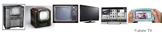
Future of entertainment is also mobile. We’re already starting to see the shift, but it’s going to extend much further than what we have today. In fact, we’d propose that you can say goodbye to your living room for most of your TV viewing. Your TV is going mobile.
It began a few years ago(2000-2004), when mobile devices started picking up the ability to display videos. It wasn’t so long ago that I encoded a file from a DVD, loaded it to the SD card and played it. Though the setup wasn’t ideal, it was exactly what I needed at the time.
Now, some 5 or 6 years later, we have devices that can natively play numerous file types, there are websites that specialize specifically in on-demand video streaming and we’re enjoying that viewing entertainment regardless of where we are.
The Apple iPad . Back when we first heard that companies were developing native players for the handheld device of choice, we were hugely excited. That hasn’t changed since the product came to market. In fact, I can tell you without any hesitation that my laptop does far more of my viewing duties than my TV could ever dream of.

Apple, one of the companies that always seems to have a finger on the pulse of the industry, has introduced AirPlay. AirPlay allows you to stream whatever is on your handheld device to your Apple TV. Why? Because Apple realizes that the majority of our consumption is going mobile, but at times we’ll want to sit and have some couch time as well.

Television manufacturers are also making intelligent moves by bringing our typically mobile content to the TV. We’re seeing integration with Facebook, Pandora, Picasa, linkedin, youtube and more, brought right into our living room. This convergence of our mobile and home-based lives is adding a sense of seamless integration which has taken the TV mobile and brought our mobile lives home.
There are 27 Million Smartphone users in india.
16 Million Streaming Video users on the smartphone.
86% use their mobile devices (smartphone/tablet) in conjunction with watching TV.
36% of all smartphone owners in India are in 16-24 age groups.
Time spent and activities on Smartphones
16-24 yrs 31 + yrs
Total Time spent on the SmartPhone 3 hrs 2 hrs
Total Time spent on Browsing & Entertainment 2 hrs 1 hr

From where we’re sitting, the future looks a lot like what we’ve seen in the past, with variations on how it’s done. For years, we’ve had mobile entertainment systems in our cars. What if, though, an accessories company makes a mount where your iPad can slip into it and be piped through your car’s audio system? What if you can have a show on your iPhone and use nexGTV to play it over your home,vehicle’s or anywhere, anytime and entertainment.
These are the things that we’re likely to see, moving forward. Between 4 and 10-inch devices ruling the market, handheld screens being a pleasure to view for extended periods and the widespread accessibility of data connections, the future of TV is, quite literally, in the palm of your hands system? Wow! Great experience, I love to see mobile TV.
Human being is lazy by nature and they don't want to change their habits. We have aligned and present the mobile TV application to the user so that user is able to use it very easily without changing their habits. That brings the user closer to the mobile TV application and might result in high and longer adoption.
Subscribe to:
Posts (Atom)